
There are many different ways to approach colour, both aesthetically and scientifically. Ceramics has played a role in the development of colour through time; the Chinese of the Sung dynasty (960–1279 AD) evolved glazes of great beauty including celedon and “clair de lune”.
Johannes Itten, the Bauhaus painter who made an important contribution to colour theory, stated “colours are forces, radiant energies that affect us positively or negatively, whether we are aware of it or not. The effects of colour should be experienced and understood, not only visually, but psychologically and symbolically.”
The problems of colour can be examined from a variety of perspectives. The physicist studies the nature of energy, vibrations and light particles. The chemist formulates the dyes and pigments that create printing inks, fabric dyes and paints. The physiologist investigates the effects of light and colour on the eye and the brain, and the psychologist studies colour symbolism: the influence of colour on our psyche. The artist explores and expresses their visions using colour based on personal aesthetics and intuition, combining visual and emotional information, along with a subjective interpretation, into a piece of art.
The ceramist or potter approaches colour firstly from a technical aspect: the colours of the clay, stains, oxides, etc, and what effects can be achieved with different glazes alone or in combination. More variations can be achieved by using different kilns and firing methods to obtain the desired colours.
Recently the development of a broad range of glaze and body stains, underglazes and on-glazes has given everyone a larger palette of colours. The need for greater understanding of colour theory and mixing, coupled with the application of colour and the development of pattern in relation to form, is now required.
CHOOSING COLOURS
Keep it simple! While it is tempting to choose an unlimited amount of ceramic colours, it may not only be expensive, but inadvisable. In order to use colour effectively it is better to start with a limited range and learn how to use it well, then add more.
Colour harmony may be achieved with as few as three colours;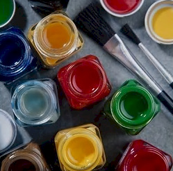
- White ….to lighten or tint a colour.
- Black ….to darken or shade a colour.
- One of the primary colours ….red, yellow or blue.
Just a simple combination can create a monochromatic tonal palette.
Initially it is best to purchase small amounts of colours until you have developed the range that you require. If you are aware of the colours that interest you, this is where to start.
To find out more about Under glazes and Stains visit these sections on our website.